Introduction
Theme Overview
Beyond Bounds is a HubSpot CMS theme designed for SaaS companies, Service providers, or Agencies. You need no coding to set up or customize our theme. Beyond Bounds is fast and friendly and offers a minimal look with a collection of pre-built templates and modules to streamline your website development process and create a visually appealing and user-friendly website.
Key Features
- 8 Basic Templates
- 8 System Templates
- 15 Theme Modules
- Responsive Design
- Accessible to all audience
Installation
Downloading the Theme from HubSpot Marketplace
- Log in to your HubSpot account.
- Navigate to the Marketplace in the main navigation menu.
- Search for "Beyond Bounds" in the marketplace search bar.
- Locate your theme and click Download.
You can also click the Buy now button below to go to Theme purchase page.
BUY NOWUsing the Theme
Activating the Theme
- In the Design Manager, locate your uploaded theme.
- Click the dropdown menu next to the theme name.
- Select Set as active theme.
Note: This will make Beyond Bounds the default theme for all new website pages and landing pages.
Theme Templates
The theme includes two sets of pre-built templates: Basic Templates and System Templates.
Basic Templates:
These templates are designed for common website pages like homepage, about us, contact us, etc. Beyond Bounds offers 8 basic templates.
- Home Page
- About Us
- Contact Us
- Features
- Pricing
- Our Team
- Blog Post
- Blog Listing
System Templates:
These templates are used for system-generated pages like blog posts, search results, etc. Beyond Bounds offers 8 system templates.
- Error 404
- Error 500
- Sign Up
- Password Prompt
- Search Result
- Email Preference Center
- Subscription Confirmation
- Unsubscribe Successful
Creating a New Page with a Theme Template.
- In the content editor, navigate to Content > Website Pages (or Landing Pages).
- Click Create and select Website page (or Landing page).
- In the Select a template dialog, choose a template from the Beyond Bounds set.
- Click Create page to start editing the content.
For more detailed instructions you can read this HubSpot Doc.
Theme Modules
Beyond Bounds includes a set of custom modules designed to enhance your website's functionality and visual appeal. Strive offers variety of custom modules which are highly customizable as per your needs:
Global Module:
- Header
- Footer
Local Module:
- Hero Banner Module - This module creates a visually striking and engaging introduction to a webpage, incorporating smooth animations to enhance the user experience. It effectively highlights key messages, promotions, or branding elements, capturing attention instantly with dynamic motion effects.
- Card-with-image Module - This module is a versatile, visually appealing component designed for displaying content in a structured card layout with an image, title, and description. It enhances user engagement by providing a clean and organized way to present information.
- Company Carousel Module - This module is a lightweight, interactive component designed to showcase a rotating list of company logos or testimonials in a visually appealing carousel format. It enhances brand visibility by providing a smooth and responsive scrolling experience
- Carousel Module - This versatile carousel module is suitable for featuring customer reviews or testimonials, allowing users to browse through positive feedback and experiences shared by others in an engaging, interactive format.
- Costumer Testimonial Module - This module is a simple yet interactive component that presents customer feedback in an engaging and visually appealing way. It enables businesses to showcase reviews, ratings, and testimonials dynamically, helping to build trust and enhance user experience.
- Expertise of Feature Module - This module is designed to effectively showcase the skills and expertise of team members through visually structured cards. It provides a clear and engaging way to highlight individual strengths, roles, and key contributions within a team.
- Faq Module - Implement this module to create an accordion-style FAQ section, with style options available in the content tab.
- Feature cards-1 - This module presents content in a structured two-column layout with cards, allowing for a visually appealing and organized display of key features or information. It enhances readability and user engagement.
- Footer Banner Module - This module provides a visually striking section at the bottom of a webpage, designed to highlight important messages, calls to action, or promotional content in an engaging and attention-grabbing manner.
- Founder Message Cards Module - This module presents a personalized message from the founder, offering insights, vision, and values of the company in a compelling and authentic way to connect with the audience.
- Pricing Card Module - This module facilitates the presentation of pricing information via cards showcasing service plans and their respective features. Style options are accessible in the style tab.
- Tabs Module - This module provides an interactive and seamless way to organize content within a compact space. Featuring smooth animations, it allows users to switch between different sections effortlessly, enhancing navigation and improving the overall user experience.
- Two-column-form Module - This module offers a structured layout for forms, presenting input fields in two columns for better organization and readability. With smooth animations, it enhances user interaction, making data entry more intuitive and efficient.
- Teams Module - This module provides a visually engaging way to showcase team members, featuring structured layouts with images, names, and roles. Animated transitions enhance the user experience, making team introductions more dynamic and interactive.
- Pricing Plan Module - This module presents various pricing options in a structured format, making it easy for users to compare features and select the best plan. Engaging animations enhance user interaction, ensuring a smooth and visually appealing experience.
Using Modules in the Page Editor
- While editing a page, drag and drop a module from the left-hand menu onto the desired section.
- Select the module type from the available Beyond Bounds modules.
- The module settings panel will appear on the right.
- Configure the module's content and appearance using the provided options.
FAQ Section
Where are the colors coming from?
By default Strive picks colors from your brand kit. If you haven’t set up your brand kit then Beyond Bounds has default colors which are: #272727 as the primary color, #FFFFFF as a secondary color, 493aff as the tertiary color, #ECEDF0 as the fourth color, #333as the fifth color, #575757 as the form Input color,#F6F6F6 as the blog background color . All module’s typography is set in their respective module's style tab.
What is the multi-column and single-column layout?
Multi-column layouts means that you can have two or more columns in a row. A good example of multi-column layout is the section which has a text column and an image column side by side.

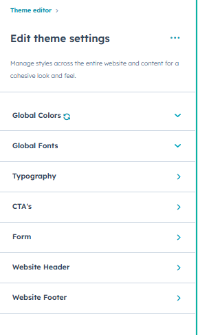
How can I change the styles and typography of text, cta & forms?
You can do that in the theme settings. You will find options to edit typography of the fonts including font-family, colors, their sizes of the individual tags. To edit the styles of the CTA and Forms there are separate groups respectively from where you can customize those as per your liking.
Still facing issues. Feel free to contact us at our email. We will get back to you as soon as possible.